Why Bootstrap 5 Is Worth Learning: It Helps Make Web Design Easier
27 Feb 2025
A New Way of Creating the Website That You Imagine
We’ve all been there—staring at a blank screen, ready to build a website from scratch, and dreading all the coding ahead. Making each part by hand—navigation bars, layouts that work on phones and computers, form styles—takes forever and can be frustrating. This is where Bootstrap 5 changes everything. Instead of fighting with CSS problems and responsive designs, Bootstrap gives you ready-made tools that make the whole process easier. Many people ask if learning a UI framework is worth the effort. Based on my experience, the answer is definitely yes. This essay shows why Bootstrap 5 is a must-have skill for web developers, how it speeds up your work, and why its benefits are worth the time it takes to learn.
What Is Bootstrap 5 and Why It Matters
Bootstrap 5 is more than just a collection of pre-made designs—it’s a complete toolkit that helps developers create professional websites quickly. It comes with ready-to-use parts like navigation menus, image sliders, and form elements, all designed to work well across different browsers.
The grid system is probably its most useful feature, letting you create layouts that adjust smoothly from big desktop screens to small phone screens. This 12-column grid gives you control over how elements resize without writing complex code for different screen sizes.
What makes Bootstrap 5 really special is its helper classes—simple CSS classes that let you style things quickly without writing custom CSS. Need to add space above something? Just use mt-3. Want to center content? Use d-flex justify-content-center. This approach saves time and keeps your code clean.
Mastering Bootstrap 5: A Small Effort for Big Results
Learning Bootstrap can seem hard at first. There are many class names, component structures, and patterns to remember. New developers often feel overwhelmed by all the options.
But this learning curve gets easier quickly with practice. Look at how Bootstrap makes creating a responsive navigation bar simple:
<nav class="navbar navbar-expand-lg navbar-light bg-light">
  <div class="container-fluid">
    <a class="navbar-brand" href="#">Brand</a>
    <button class="navbar-toggler" type="button" data-bs-toggle="collapse" data-bs-target="#navbarNav">
      <span class="navbar-toggler-icon"></span>
    </button>
    <div class="collapse navbar-collapse" id="navbarNav">
      <ul class="navbar-nav">
        <li class="nav-item"><a class="nav-link active" href="#">Home</a></li>
        <li class="nav-item"><a class="nav-link" href="#">Products</a></li>
        <li class="nav-item"><a class="nav-link" href="#">About</a></li>
        <li class="nav-item"><a class="nav-link" href="#">Contact</a></li>
      </ul>
    </div>
  </div>
</nav>
Believe it or not, this short code creates a fully working navigation menu that also works on mobile phones—something that would take much more custom HTML, CSS, and JavaScript to build from scratch. I can guarantee that the time spent learning these patterns will eventually pay off by making your projects much faster in the future.
Build Websites Faster Using Their Pre-Made Code
The best reason to use Bootstrap 5 is how much faster it makes building websites. By providing ready-made, well-tested components, Bootstrap saves you from having to recreate common website elements for each project.
This speed becomes really clear when making responsive websites. Without using Bootstrap, you will be needing to write complex codes to handle those different screen sizes, which I think is a very time-consuming process that often leads to problems and issues. Bootstrap’s grid system makes this simple:
<div class="container">
  <div class="row">
    <div class="col-12 col-md-6 col-lg-4">
      <!-- Content that takes full width on phones, half width on tablets, and one-third on desktops -->
    </div>
    <div class="col-12 col-md-6 col-lg-8">
      <!-- Content that resizes based on screen size -->
    </div>
  </div>
</div>
This straightforward approach to responsive layouts saves tons of development time while ensuring your site works well and looks amazing on all devices. For developers with tight deadlines or multiple projects, this efficiency is extremely valuable.
Works on All Browsers Without Headaches
Now one of the often overlooked benefits of Bootstrap is how nicely it plays in all browsers. The system works out thousands of browser quirks behind the scenes, so your elements look consistent whether they’re viewed in Chrome, Firefox, Safari, or Edge.
This consistency also carries over to the way your site acts on different devices. Bootstrap’s framework uses thoroughly tried and tested responsive patterns that work uniformly on every kind of device—from the most recent smartphones to tablets, laptops, and broad desktop monitors.
For businesses and professionals, this stability means fewer hassles. The same performance is provided to visitors irrespective of the browser or device being used, eliminating the support issues that often come with custom sites. With this, development teams no longer need to invest their time in fixing browser compatibility issues but can focus on crafting unique features, thus making projects simpler.
My Real Experience: The Tiffany & Co. Project
My personal experience with Bootstrap became clear during a challenging project to recreate the Tiffany & Co. website. At first, I was worried about the brand’s sophisticated design, expecting weeks of detailed CSS work to capture its elegant look and subtle interactions. But the magical Bootstrap 5 made this intimidating task manageable. The grid system helped me recreate Tiffany’s perfectly aligned product displays. Ready-made components sped up development of the navigation, product cards, and image galleries. Most surprisingly, Bootstrap’s helper classes let me make quick styling adjustments without writing a lot of custom CSS.
Take a look at the two screenshots below!
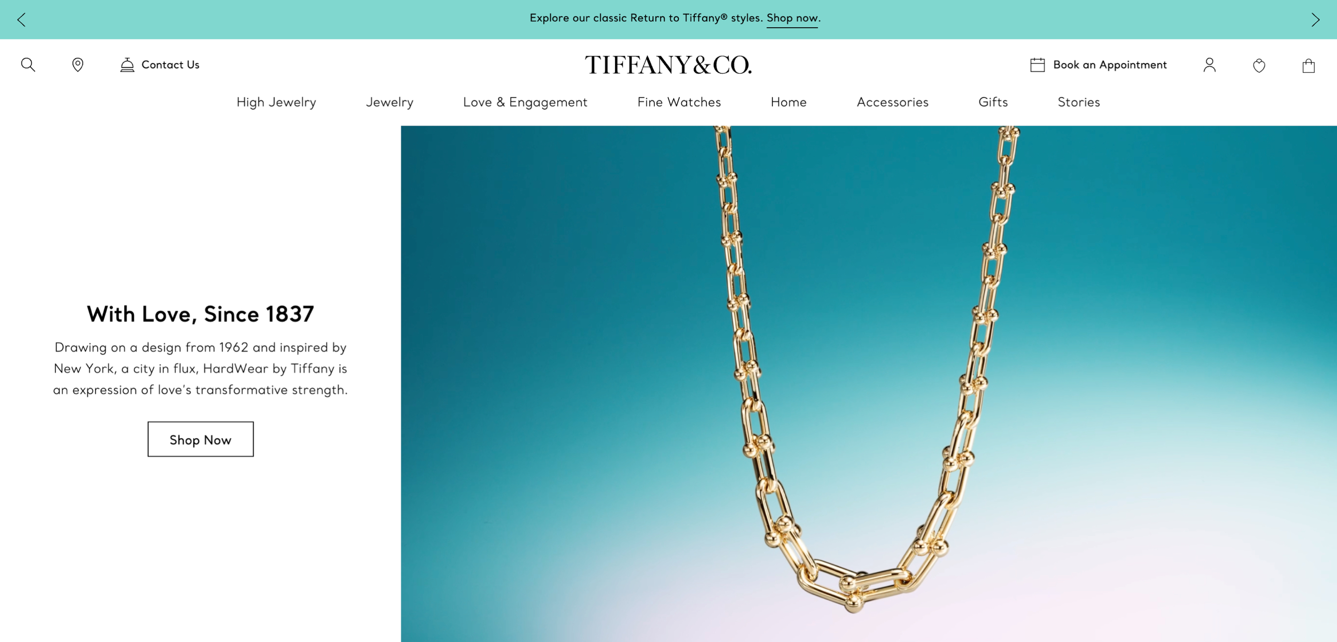
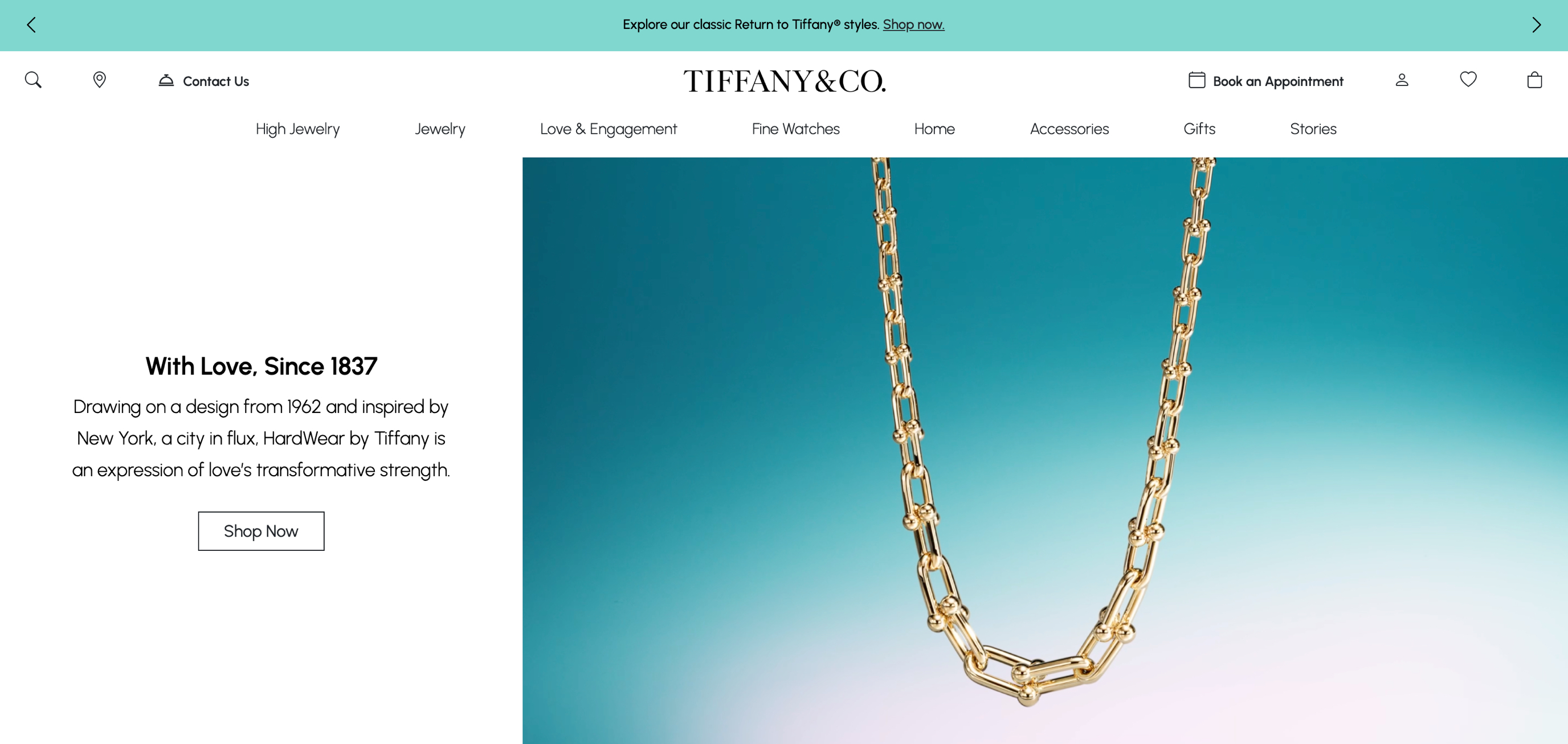
Haha, I bet you can’t even tell the difference between the two! But if you guessed correctly, the image on the left is the original Tiffany & Co. homepage, and the one on the right is the homepage I recreated using Bootstrap.
The project wasn’t just successful because it looked good—the Bootstrap implementation worked perfectly on different screen sizes, keeping the brand’s premium feel across all devices. What might have required hundreds of lines of custom CSS and extensive testing was accomplished efficiently with Bootstrap’s well-designed components and helpers. I’m actually so impressed with how closely I was able to recreate the webpage!
Making Bootstrap Look Unique
A common criticism of Bootstrap is that websites built with it all look the same. While this may have been true for older versions, Bootstrap 5 offers many customization options that let developers create truly unique designs.
The framework now uses variables for easy theming, letting developers change default colors, fonts, spacing, and component styles. This approach keeps the framework’s structural benefits while allowing complete visual customization:
<div class="card">
  <img src="product.jpg" class="card-img-top" alt="Product Image">
  <div class="card-body">
    <h5 class="card-title">Product Name</h5>
    <p class="card-text">This is a description of the product with all its amazing features.</p>
    <a href="#" class="btn btn-primary">Buy Now</a>
  </div>
</div>
This flexibility lets developers use Bootstrap’s robust component library and responsive utilities while creating unique brand identities. The result combines development speed with design originality—the best of both worlds.
Learning Faster With The Help of AI
AI coding tools have made learning Bootstrap much easier. Tools like GitHub Copilot, ChatGPT, and code generators can suggest Bootstrap patterns, complete component structures, and even generate entire layouts based on simple descriptions. These AI tools work like interactive documentation, helping developers discover Bootstrap’s features through contextual suggestions rather than searching through reference guides. When facing unfamiliar components or styling challenges, developers can ask for examples and explanations from AI assistants, making the learning process much faster.
In my software development class as well, AI tools have been incredibly helpful for my Bootstrap assignments. When I’m stuck on a layout problem or can’t remember a specific class name, I can quickly ask for guidance. This has been especially useful for complex assignments like recreating existing websites or building multi-page projects. Since our professor expects us to meet tight deadlines, having AI assistance helps me complete assignments on time while actually understanding the Bootstrap concepts rather than just copying code. It’s like having a patient tutor available 24/7 who can explain Bootstrap concepts in different ways until I understand them.
Beyond basic code completion, I truely believe that AI tools excel at helping developers customize Bootstrap components, offering suggestions for changing default styles while maintaining responsive behavior. This collaboration between human creativity and AI assistance creates an ideal learning environment, allowing developers to master Bootstrap faster than ever before.
Conclusion: Why Bootstrap Is Worth It
Bootstrap 5 is more than just a set of components—it’s a powerful tool that makes web development faster, keeps designs consistent across browsers, and improves workflow. While it takes some time to learn, it quickly saves time on future projects and helps create high-quality websites more efficiently.
Looking back on my Tiffany & Co. project, I can confidently say that Bootstrap 5 turned what could have been weeks of custom development into days of productive work. The framework did not only deliver speed but also reliability, since the resulting site looked great on devices and browsers.
For programmers who are wondering if they should take their time to learn Bootstrap, ask yourself this: Do you want to invest your time repeatedly breaking the same layout and style problems, or do you want to invest your time building what makes every project different? Bootstrap takes care of web development boilerplate patterns so that you can focus on the special things about your sites.
In today’s age of rapid growth, Bootstrap 5 isn’t just nice to have—it’s a competitive advantage that gives better results sooner. That’s an investment that I think is worth making, and I am so glad that I was able to discover such an amazing tool that simplifies web development and helps bring ideas to life with ease.
This essay was reviewed using AI(ChatGPT) for grammar checking to ensure and correctness and improve readability.